Localities Widget Guide
Installation, configuration, usage and customization of the Woosmap Localities Widget for embedding location search functionality into your website with ease.
The Woosmap Localities Widget lets you easily embed a search box for localities, postcodes, addresses, and other places in your website. It’s fast to set up and highly customizable.
Sample Usage
This example shows how to integrate the Localities Widget to search for cities and postal codes matching user input.
        function init(): void {
  const responseElement = document.getElementById(
    "response-container",
  ) as HTMLElement;

  //@ts-ignore
  const localitiesWidget = new window.woosmap.localities.Autocomplete(
    "autocomplete-input",
    {},
  );

  localitiesWidget.addListener("selected_suggestion", () => {
    const selectedLocality = localitiesWidget.getSelectedSuggestionDetails();
    if (responseElement) {
      responseElement.innerHTML = `<code>${JSON.stringify(selectedLocality, null, 2)}</code>`;
      responseElement.style.display = "block";
    }
  });
}

document.addEventListener("DOMContentLoaded", () => {
  init();
});

declare global {
  interface Window {
    // currently, the localities JS Widget typings are not exported, so we use `any` here
    //@ts-ignore
    woosmap: {
      localities: {
        Autocomplete: new (inputId: string, customConfig: any) => any;
      };
    };
  }
}
        function init() {
  const responseElement = document.getElementById("response-container");
  //@ts-ignore
  const localitiesWidget = new window.woosmap.localities.Autocomplete(
    "autocomplete-input",
    {},
  );

  localitiesWidget.addListener("selected_suggestion", () => {
    const selectedLocality = localitiesWidget.getSelectedSuggestionDetails();

    if (responseElement) {
      responseElement.innerHTML = `<code>${JSON.stringify(selectedLocality, null, 2)}</code>`;
      responseElement.style.display = "block";
    }
  });
}

document.addEventListener("DOMContentLoaded", () => {
  init();
});
        /*
 * Always set the map height explicitly to define the size of the div element
 * that contains the map.
 */
#map {
  height: 100%;
}

/*
 * Optional: Makes the sample page fill the window.
 */
html,
body {
  height: 100%;
  margin: 0;
  padding: 0;
  font-family: ui-sans-serif, system-ui, -apple-system, BlinkMacSystemFont, Segoe UI, Roboto, Helvetica Neue, Arial, Noto Sans, sans-serif, Apple Color Emoji, Segoe UI Emoji, Segoe UI Symbol, Noto Color Emoji;
}

body {
  background-color: #eee;
  overflow-y: hidden;
}

#autocomplete-container {
  display: flex;
  position: absolute;
  top: 10px;
  left: 10px;
  z-index: 1;
  box-shadow: 0 2px 4px rgba(0, 0, 0, 0.2), 0 -1px 0px rgba(0, 0, 0, 0.02);
  background: #fff;
  max-width: 320px;
  width: 100%;
  height: 42px;
  border: none;
  box-sizing: border-box;
  align-items: center;
  cursor: text;
  font-size: 15px;
}

#autocomplete-input {
  box-sizing: border-box;
  height: 40px;
  line-height: 24px;
  vertical-align: top;
  transition-property: color;
  transition-duration: 0.3s;
  width: 100%;
  padding: 0 12px;
  text-overflow: ellipsis;
  background: transparent;
  border-radius: 0;
  border: 0;
  margin: 0;
  outline: 0;
  overflow: visible;
  appearance: textfield;
  font-size: 100%;
}

.localities-input-wrapper, .localities-input-container {
  width: 100%;
}

pre {
  display: none;
  margin: 70px 10px;
  max-height: calc(100vh - 110px);
  padding: 10px;
  border: 3px solid #c8c8c8;
  background-color: white;
  border-radius: 8px;
  white-space: pre-wrap;
  overflow-x: auto;
  font-family: Consolas, "Andale Mono WT", "Andale Mono", "Lucida Console", "Lucida Sans Typewriter", "DejaVu Sans Mono", "Bitstream Vera Sans Mono", "Liberation Mono", "Nimbus Mono L", Monaco, "Courier New", Courier, monospace;
}
        <html>
  <head>
    <title>Localities JS Widget</title>
    <meta name="viewport" content="width=device-width, initial-scale=1.0" />
    <meta charset="utf-8" />

    <script src="https://sdk.woosmap.com/localities/localitieswidget.2.0.js?key=woos-48c80350-88aa-333e-835a-07f4b658a9a4"></script>
    <link
      rel="stylesheet"
      href="https://sdk.woosmap.com/localities/style.2.0.css"
    />

    <link rel="stylesheet" type="text/css" href="./style.css" />
    <script type="module" src="./index.js"></script>
  </head>
  <body>
    <div id="app">
      <div id="autocomplete-container">
        <input
          type="text"
          id="autocomplete-input"
          placeholder="Search a locality or a postal code..."
          autocomplete="off"
        />
      </div>
      <pre id="response-container"></pre>
    </div>
  </body>
</html>
Quick Start Checklist
- Add the Widget Script and CSS to your HTML (replace with your API key):
<script src="https://sdk.woosmap.com/localities/localitieswidget.2.0.js?key=YOUR_API_KEY"></script> <link rel="stylesheet" href="https://sdk.woosmap.com/localities/style.2.0.css" /> - Create an input element with a unique ID:
<input id="autocomplete-input" type="text" placeholder="Search a locality or a postal code..." /> <pre id="response-container"></pre> - Add basic CSS for layout and response display (optional):
#autocomplete-input { width: 100%; padding: 8px; font-size: 16px; border: 1px solid #ccc; border-radius: 4px; } #response-container { background: #f9f9f9; border: 1px solid #eee; padding: 12px; font-size: 14px; color: #333; border-radius: 4px; margin-top: 12px; display: none; } - Instantiate the Widget in your JS:
        function init() {
  const responseElement = document.getElementById("response-container");
  const localitiesWidget = new window.woosmap.localities.Autocomplete(
    "autocomplete-input",
    {},
  );
  localitiesWidget.addListener("selected_suggestion", () => {
    const selectedLocality = localitiesWidget.getSelectedSuggestionDetails();
    if (responseElement) {
      responseElement.innerHTML = `<code>${JSON.stringify(selectedLocality, null, 2)}</code>`;
      responseElement.style.display = "block";
    }
  });
}
document.addEventListener("DOMContentLoaded", () => {
  init();
});
Settings Overview
Please refer to the Localities Reference for all configurable settings. Below is a summary of main parameters (all optional):
minLength
Localities search triggers when the number of typed chars is >= minLength. Defaults to 1.
"minLength": 3
types
Requested suggestion type: ‘locality’, ‘postal_code’, ‘address’, ‘admin_level’, ‘country’, ‘train_station’, ‘metro_station’, ‘shopping’, ‘airport’, ‘museum’, ‘zoo’, ‘amusement_park’, ‘art_gallery’, ‘tourist_attraction’.
When omitted, returns localities + postcodes.
"types": "locality"
data
Default config returns postcodes for most Western Europe countries. “advanced” returns postcodes for any country. Defaults to ‘standard’.
"data": "advanced"
extended
Allows refined search over locality names that share the same postal code.
components
Restricts results to a single country or array of countries (ISO 3166-1 Alpha-2 codes, case insensitive). If your use case is specific to certain countries, always use this parameter for more accurate suggestions.
        "components": { "country": "es" }
"components": { "country": ["fr", "es"] }
location
Adds a bias to autocomplete results. Specify as a LatLngLiteral object ({lat: 43.4, lng: 3.883}) or a string (43.4,3.883).
Tip: Use the location parameter to prioritize results near your users. For example, for Spain, set {lat: 40.4168, lng: -3.7038} for Madrid.
Translations Settings
Display results in different languages. Set the language parameter in your config (e.g. {language: "en"}).
Multiple Settings Example
        {
    "minimumInputLength": 3,
    "types": ["locality", "postal_code"],
    "data": "advanced",
    "components": { "country": ["fr", "es"] },
    "language": "zh"
}
Customizing Suggestions & Appearance
Custom Description
Use the custom_description parameter to change the format of autocomplete suggestions.
Main Widget CSS Classes
Use these classes to customize the widget and harmonize it with your UI:
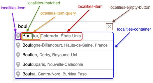
Keyboard-selected result line will receive an additional localities-item-selected class.
Default Localities Widget Styles
Override these styles to customize your widget display:
        .localities-container { color: #FFF; box-shadow: 0 4px 5px rgba(0,0,0,0.1) }
.localities-item { color: #7B7B7B; }
.localities-item-query { color: #7B7B7B; }
.localities-icon { background-color: #b2b2b2; }
.localities-matched { color: #000; }
.localities-input { color: #000; border-radius: 0; }
.localities-item-selected, .localities-item:hover { background-color: #edf4f9; }
.localities-item-selected .localities-icon, .localities-item:hover .localities-icon { background-color: #5586ff; }
Troubleshooting & Best Practices
- API Key Issues: Double-check your API key and domain restrictions in the Woosmap Console.
- Country Restriction: Always set the
components.countryparameter for more relevant results. - Styling: Use your own CSS to match the widget to your site’s look and feel.
- Accessibility: Ensure your input element is accessible (label, ARIA attributes).
- Performance: Use
minLengthto avoid unnecessary API calls.